
Put simply, data storytelling is the process of compiling and visualising your data in a way that presents a compelling narrative to the intended audience. Nowadays, businesses have access to a wealth of often complex data but understanding it and uncovering insights can often be the challenging part. Effective data storytelling can offer numerous benefits:
It goes without saying but data is the foundation of a good data story. Without the data, you cannot produce effective visualisations or tell a story. Collecting and analysing data is a key step in your data storytelling journey.
Based on the data, what story do you want to communicate to your audience? What data insights will you look to provide to your audience? These are key questions that you need to consider when crafting a good data story.
Make the data come to life through data visualisation. This is the process of using visual mediums to present the data in a more engaging and memorable way. Graphs, charts, maps and infographics can all be used.
A great way to help tell your data story is with a management information (MI) dashboard.
A management information dashboard is a highly visual summary of various data sources that reports on any number of business questions such as:
The term – management information dashboard - was borrowed from the world of vehicles, where a dashboard displays all the critical control panels and indicators within a car or aircraft to allows the navigator to determine the state of play at a single glance.
The same principle applies in data analytics and reporting, whereby the end-user can very quickly understand key metrics or trends without having to plough through War and Peace!
Below is a short guide on some best practice to consider in order to create an effective dashboard to tell a story.
Remember to think about your end-user, both in the development of the dashboard, producing guides and additional information, and documenting the activity for future stakeholders and users.
We are experts in building dashboards in various platforms, such as Tableau, Power BI, and Apteco Orbit. If you need help building yours, then just get in touch.
Design is the principal foundation of a smart and effective MI dashboard. It has several key components:
Dashboards vary by content and depth. Some clients or third parties will want a view on all metrics and verticals, whereas other requirements will be more minimal, such as only including a handful of KPI figures and a chart.
Whilst the latter might seem easier and more straightforward, it still carries the same challenges as the busier and more demanding shopping lists, since the content still needs to be cohesive and relevant.
Before any work is undertaken, the complete list of required outputs must be agreed.
Usually, this involves a consultation with the stakeholder and/or users where the dashboard objectives will be discussed and you come up with a list of outputs in the form of metrics and visualisations This is likely to be iterative, with options discussed, and going back and forth, before the final brief is settled on. Once this has been established, we move onto content organisation.
‘Storytelling with data’ sums up how dashboard reports can bring data to life through compelling visualisations that allow the user to determine or understand the overall picture. This might include the success of a competition or a promotion, the sales pipeline for a new product, the customer reach for a new subscription platform, or any host of business ventures.
Within a simple written story, there are narrative structures to guide the reader to understand the who, what, where, and when of the plot. These same components are required for dashboards.
The front page of the dashboard should contain the KPI figures, whatever they may be. This might be total customer volume, total sales value, or new sign-ups.
The metrics behind the dashboard should be the first view in which the user can immediately get a sense of the state of play. Sometimes this is referred to as a database health check, where all the key metrics are assembled. Not everything is a KPI, as not everything is ‘key’. What do you need to see that measures what really matters, at a glance?
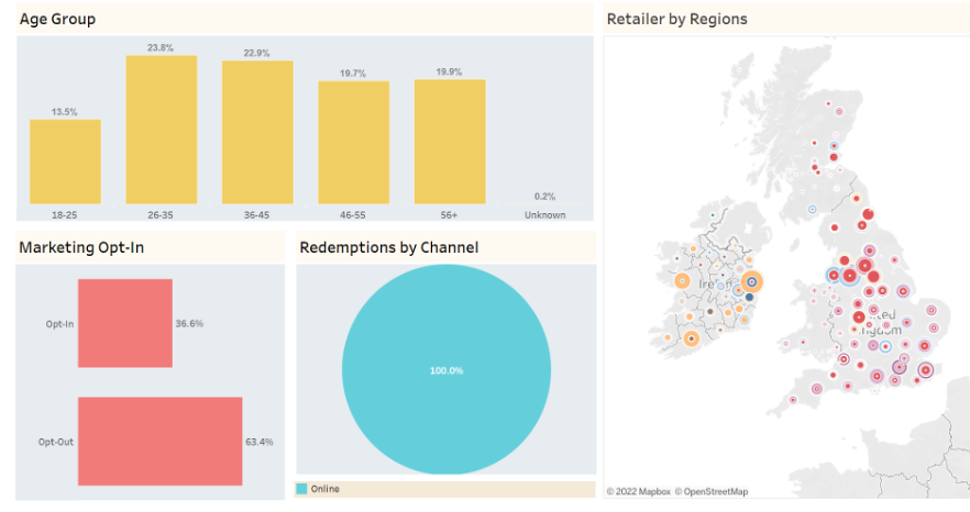
Any content that might involve asking the question ‘who?’ and ‘where?’ has a profiling focus.
We want to understand ‘who’ buys the product, or ‘where’ there is reach. Grouping together customer demographics such as age and gender with location can provide a simple, uncluttered view of the customer base. Below is an anonymised example:
Are we visualising sales or products, by sub-category crosstabs, email activity, response data? What data sources are we bringing in, where do they come from, how do we get them into the tool, how often are they refreshed, are they accurate, how can we minimise/remove any manual intervention?
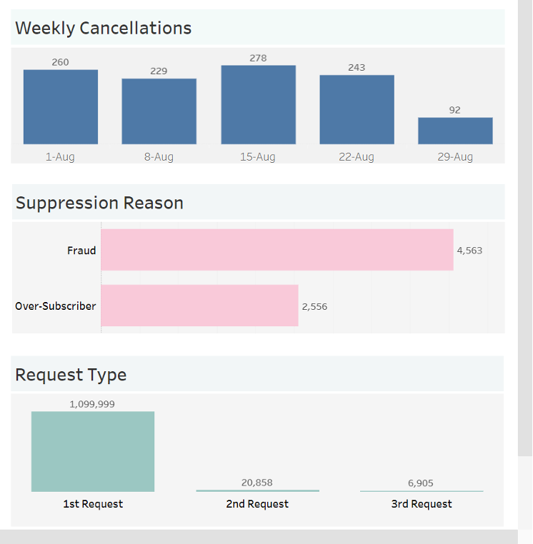
Content that gives a view of ‘when’ something happened can be grouped into an area that focuses on timelines - for example, a graph of sales volumes over time, whether monthly, daily, or weekly, with parameter actions to create charts with dynamic date displays. You could also relate that to media or marketing activity over time to see the correlation. You could also include growth indicators, such as YoY% or WoW%. These are thematically tied to when an event took place and so can be displayed here.
Cramming too much information into a section can and will detract from the power of the insight, so don’t be afraid to have more tabs if the sections would suffer from overcrowding.
The mantra of visual data storytelling is ‘less is more’.
Using the power of parameters and filters, we can include multiple layers of data that can be accessed with a single click. This dynamic functionality reduces the clutter and compresses the view, without losing any of the detail.
This allows you to sub-set your data so that it can be accessed without the need for multiple charts. It also allows for user interaction, giving them the choice to slice and view the data visuals as they wish.
A single chart can display multiple metrics such as email opens, clicks, or unsubscribes, using parameter actions. Similarly, a category filter can allow a user to toggle between a visual display of sales for jeans or trainers, for example.
The aim is always to present a clear but toggle-friendly view of the data.
Popular dashboarding tools such as Tableau and Power-BI allow developers to size and shape charts, where fonts, headers, and labelling should be bold, clear, and consistent.
Below is another data storytelling example of formatted charts and filters on a single dashboard slide:
Colour brings your visuals to life. The right palette can provide a slick and professional-looking finish, and ideally should reflect your brand - but not slavishly so. Whilst loud primary colours can certainly catch someone’s eye, they can also be overbearing and clash with other elements.
Consider using pastel colours as backgrounds, which are easier on the eye. If you want to use brighter colours like hot pink or sky blue, reducing the transparency can minimise the garishness whilst maintaining an eye-catching visual. Adding white borders around bar columns or pie chart slices can add a crisp edge that defines the visual.
If you’re producing a visual or KPI with the same metrics, then use the same colour for the chart colour and font in the KPI card. This thematically unites them. Avoid using the same colour for different verticals on the same slide as it can create confusion. Even though all charts should be clearly labelled - the users will be drawn in on the visuals first, text second.
MI dashboards should always endeavour to deliver a carefully structured visual output. Colour is instrumental in achieving this.
DCX always put data at the forefront of everything we do. As part of FirstGroup’s programme of digital transformation initiatives, which aimed to re-imagine the customer experience and improve revenue, we provided dashboard solutions that visualised key metrics in an easy to understand and digestible way. This enables FirstGroup’s key stakeholders to have an always-on view of performance to aid decision-making. Read the full FirstGroup digital transformation case study.
As Apteco partners, our team are well versed in all things Apteco, using Apteco Orbit to create powerful dashboards for our clients. DCX has worked closely with Health Education England to create a series of registration dashboards so that their team could have the relevant data they need at their fingertips, quickly. Discover how we helped HEE in more detail here.
For over 20 years, we’ve been helping some of the biggest organisations in the world make sense of, and visualise their data in a way that helps them make better business decisions.
Whatever your data and reporting need, we can help.
Get in touch with us to learn how we can help tell your story with data!
Do Business.
Better.
Want to talk?