1. Email design approaches - Dark Mode
“33% of email marketing teams still don’t design specifically for Dark Mode.”
Litmus asked: “Does your design philosophy account for Dark Mode?” The report found that a shocking 33% of organisations don’t design or code with Dark Mode in mind.
Dark Mode isn’t really a “feature” anymore, especially considering that 40% of subscribers are viewing emails in Dark Mode. It should be an everyday essential when it comes to email design.
While it can be difficult to code for Dark Mode due to all the inconsistencies and complex methods across various email apps and operating systems, ignoring it all together isn’t really the way forward.
Neither is trying to force your email into the “light mode” version when your subscriber has purposefully chosen a dark interface, whether that be to minimise eye strain, reduce screen brightness to save battery life, or improve content legibility. Your subscriber’s choice should be respected.
While 27% of marketing teams are optimising both images and code (the ideal solution), if you don’t fall into this group, at a minimum you should be optimising images along with 19% of other marketing teams as noted in the report.
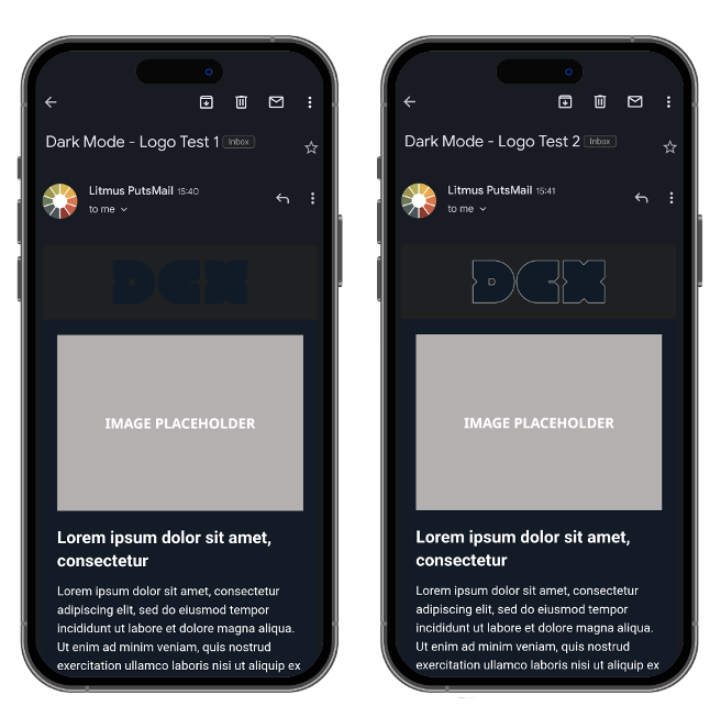
If you have a black or near-black logo with a transparent background at the top of your email, this could ultimately disappear in Dark Mode, immediately losing your brand recognition. Adding a white background or stroke to your logo could quickly improve that image.

Whatever your Dark Mode decisions are, it’s important to always make sure to continuously render test on different devices to ensure you’re giving your recipients the best experience.
2. Graphic design tools for email
“The top graphic design program was Adobe Photoshop (58%), followed by Adobe Illustrator (37%), and then Adobe InDesign (31%).”
While it makes sense that Photoshop used to be the predominant graphic design tool for email in the past, it’s surprising to still see it at the top of this list in 2023, followed by two similar tools designed for a different creative purpose.
Overwhelmingly, email design specialists are gravitating towards tools like Figma, Adobe XD, and Sketch, because these are web-first design tools.
While Photoshop, Illustrator, and InDesign are suited to print-orientated design, Figma, Adobe XD, and the like, are more efficient for email.
At DCX, for example, we use Adobe XD for all our email designs, which allows us to easily collaborate throughout the design process, from conception and wireframing to hand-off to developers. From saving and reusing components to responsive resizing, these types of tools (as mentioned above) are built with mobile and web experiences in mind.
All of this means that, when sharing design specifications with development teams, one single shared prototype link includes all the information the team requires.

3. Email personalisation
“Over 45% of personalisation users saw improvement with interactive email.”
It’s important to note that “64% of emails sent by companies [make use of] personalisation using dynamic content, and over half of email marketing teams want to improve their content personalisation. At this point, personalised emails are an industry standard and requirement!”
Email personalisation should be a given for all organisations by now, and we’re not just talking about ensuring your recipient’s first name is in the email. The aim should be for your email to resonate with its recipient, and as Litmus showed in their 2023 State of Email Workflow Report – 80% of customers are more likely to make a purchase after a personalised experience.
The top email elements Litmus has defined for personalisation are personalised dynamic content, personalisation in the subject line, animated GIFs, or PNGs, emojis in the subject line, interactivity powered by HTML and CSS, video, and images powered by CRM data.
While personalisation on this level requires more development effort per email campaign, it’s fantastic to see interactivity powered by HTML and CSS on the list for improving performance – it can improve performance by 45%!
If you can incorporate CSS animations, carousels, or drop-down menus directly in the inbox, it will enhance your recipient’s engagement with your brand.

4. Email and AI
“41% of marketers say that AI leads to higher revenue generation from email campaigns, as well as a 13% improvement in click-through rates.”
This is a staggering statistic, especially with clicks being a strong metric indicator over opens these days.
However, let’s look at another quote on the same page: “There’s another important distinction to be made when we talk about AI - not all AI is created equal. Generative AI, like ChatGPT, is only as good as the inputs you feed it. And like all machine learning tools, must be trained on something.”
While the conversation around AI is still ongoing, there’s a definite need to invest time and research into AI options.
When it comes to email and AI, we partner with Dotdigital whose campaign tools are powered by WinstonAI. Dotdigital allows you to eliminate guesswork with AI recommendations, empower data-driven decisions with predictive analytics, and optimise send time – allowing you to learn, improve, and conduct A/B tests.
How DCX can help
When it comes to email design, there’s a lot to consider.
DCX has been doing all the key things we highlighted in the report – from designing for Dark Mode and Litmus testing each and every email we build to consciously assess the quality of the rendering to complex email personalisation and the use of AI – for many years.
Get in touch with us to learn more about how we can improve your email viewability, deliverability, and design.


