
Colour contrast accessibility in email design is about ensuring email content is accessible to all users, including those with visual impairments such as colour blindness.
The intent of the colour contrast accessibility is to provide enough contrast between text colour and background colour, so that all digital content is easily recognisable and equally accessible to all users.
According to WCAG, contrast is measured by comparing the difference in perceived brightness between two colours. The colour contrast is calculated as a ratio of the relative luminance of two colours ranging from 1:1 to 21:1.
To meet these standards, email text and elements should have a colour contrast of at least 4.5:1.
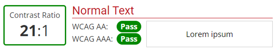
Black (#000000) on white (#FFFFFF) has a ratio of 21:1.
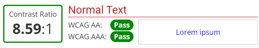
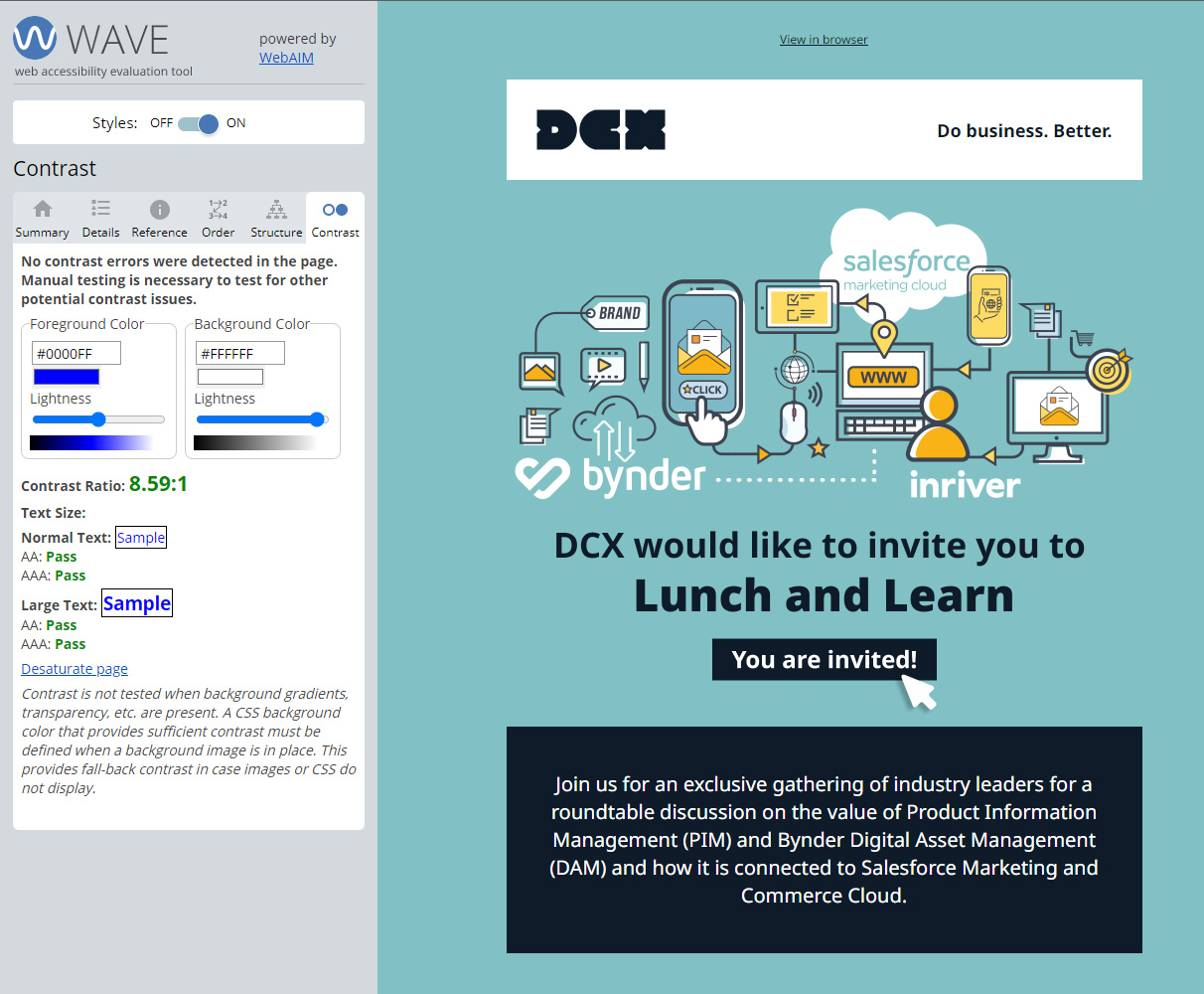
Blue (#0000FF) on white (#FFFFFF) has a ratio of 8.59:1.
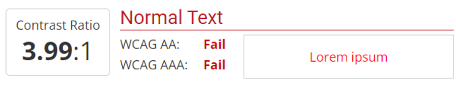
Red (#FF0000) on white (#FFFFFF) has a low ratio of 3.99:1.
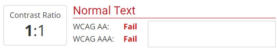
Light grey (#FEFEFE) on white (#FFFFFF) has a very low ratio of 1:1 – this will be impossible to read.
Contrast ratios between colours can be tested using a variety of free web tools such as:
There are three levels of conformity established by the WCAG: A, AA, and AAA.
To meet Level AA, text should have a contrast ratio of at least 4.5:1. To meet Level AAA, text should have a contrast ratio of at least 7:1.
Headings and sub-headings, however, can have a contrast ratio of 3:1.
There are no contrast requirements for logo or banner text.
Drop-down menus, checkboxes, radio buttons, and slides, should have a contrast ratio of 3:1.
Graphic elements that are required to understand the content should also have a 3:1 contrast ratio.
Avoid low colour contrast between text and background – for example, light grey text on white background – as it affects the readability of the email, especially for viewers with low vision or those who are colour blind.
Use accessible contrast ratios for links and buttons, avoid opacity and colour changes on hover, and consider more accessible options such as underline or increase of font size.
Use Alt text for images, as most email clients do not initially render images. Where possible, use colours that meet WCAG guidelines, use simple images, and avoid using text over complex colourful images or backgrounds.
Here at DCX, we combine the power of data with compelling creative and digital technology to help brands connect better with their customers for better outcomes.
From digital strategy and consultancy services to creative concepts and content, we'll give you a bespoke service offering of our email marketing expertise, gained over the past twenty years.
Want to get started with better email accessibility and transforming your email campaigns to be more inclusive? Talk to us today.
Do Business.
Better.
Want to talk?