The University of Edinburgh
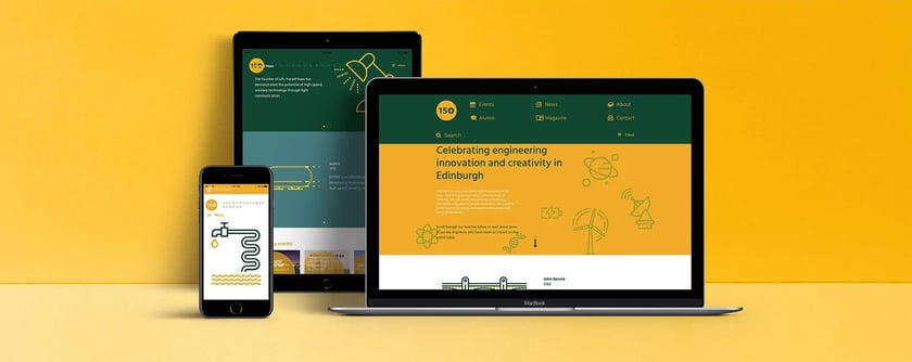
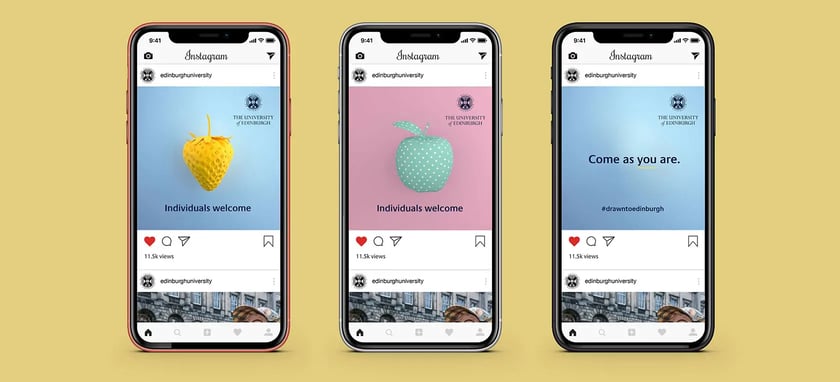
We created digital and print campaigns to increase awareness among groups who might not normally consider attending university, and to attract applications from students around the world.
Our visual transformation of the alumni magazine has increased engagement with former students and potential funders, while work on the university’s suite of printed prospectuses has been driven by the need for clear, compelling and more focused information.
Exhibitions, websites and UX design add to a full-service offering.
Despite the variety in terms of scope and scale, every project began with a solid understanding of the university’s dynamic marketing strategy, and continues through innovative design, targeted campaigns and communications, digital development, and print management.
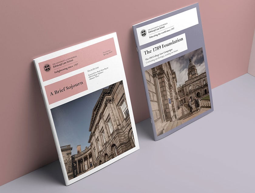
Edinburgh Law School
Established more than 300 years ago, Edinburgh Law School is one of the leading law schools in the world, and has a global reputation for academic and research excellence.
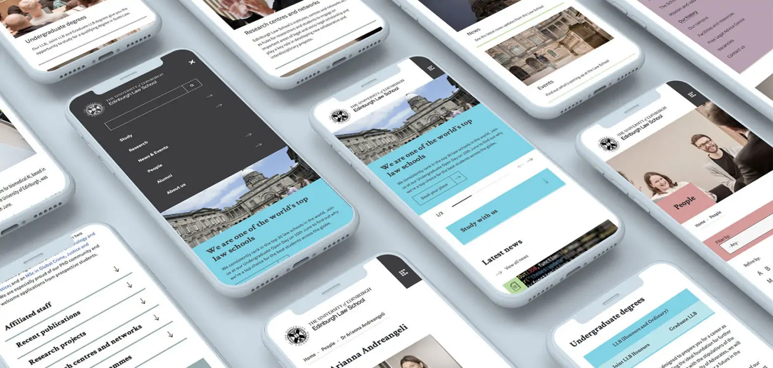
As part of a drive to communicate that heritage, prestige and world-class teaching to a global audience - and position themselves at the forefront of law education - the School tasked DCX to refresh their visual identity and website.
Our primary challenge was to create a visual style that would be clearly recognisable as Edinburgh Law School but remain aligned with the University’s core brand.
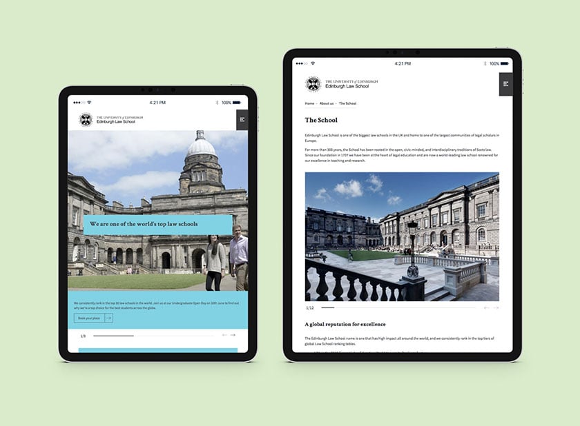
Therefore, we combined the University’s typefaces, logos, and more muted colours with a flexible grid and distinctive photographic style for an understated yet confident approach that positioned the law school as among the best in the world.
The new website reflects this visual direction, and was given a complete overhaul to improve user experience, make content more accessible and navigable, and provide a positive insight for potential students, researchers, and industry partners.
Talbot Rice Gallery
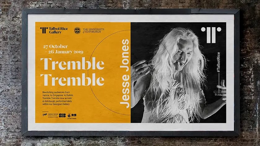
The Talbot Rice Gallery, tucked away in a corner of the University of Edinburgh’s iconic Old College, has been described as one of Edinburgh’s best kept secrets.
Regarded by experts as a leading gallery of contemporary visual art, it is largely unknown among wider audiences.
We were challenged to create a recognisable and memorable visual identity that could be used to increase the gallery’s profile and spearhead its programme of events and exhibitions – while never losing sight of its links with the University or its status as an architectural icon.
Our solution was to develop a mark that was bold and confident but not overpowering; letting the art and the building share centre stage.
Based on a Byzantine pillar, a feature of Edinburgh’s Georgian architecture, it uses a monogram to present the gallery’s initials. Simple and symmetrical, the mark faces in, and out, to reflect Talbot Rice as an open and welcoming space for students, locals and visitors – as well as one of the world’s most highly regarded university art galleries.

Results
The University of Edinburgh now has a strong visual identity, including across its sub-brands, that is helping to:
- increase awareness among groups who might not normally consider attending university
- attract applications from students around the world
- increase engagement with former students and potential funders
- make online content more accessible and navigable
- provide a positive insight for potential students, researchers, and industry partners